


Introduction
Nothing hurts conversions more than an ugly form. Clashing colors, unreadable fonts, and clunky fields can make a person reconsider giving you their information. However, by following a few key form design principles, you can better capture attention and boost form conversions.
Read on for web form design tips that will help you create an enjoyable user experience and collect more submissions.
Form Length: Shorter or Longer?
A classic debate in design is whether to make your forms short or long. The answer? Go as short as possible.
Short forms work better because they:
- Are less intimidating. People don’t like filling out long forms.
- Are easier to complete on mobile. The less scrolling, the better.
- Force you to reconsider your questions and cut out the fluff.
- Take less time to fill out, minimizing form abandonment.
3 Ways to Tackle Long Forms
Sometimes a long form is necessary if you need to gather a lot of information. If you’re worried about length, here are three form design tricks you can use to create forms that appear shorter and less daunting.
1. Embrace the multi-page form.
Break long forms into smaller chunks across multiple pages. Our Form Conversion Report found that form submission rates more than triple when fields are spread over multiple pages.
2. Let users track their progress.
Some people become anxious when they don’t know how long a task will take to complete. Include a progress bar on your form to prevent those people from dropping off.
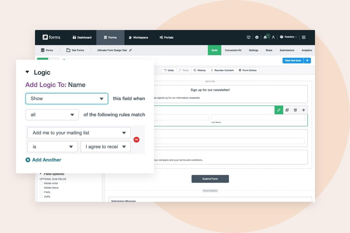
3. Simplify your form with logic.
Create the illusion that your form is shorter than it really is via Conditional Logic. This lets you show or hide questions based on how someone responds to fields on the form.
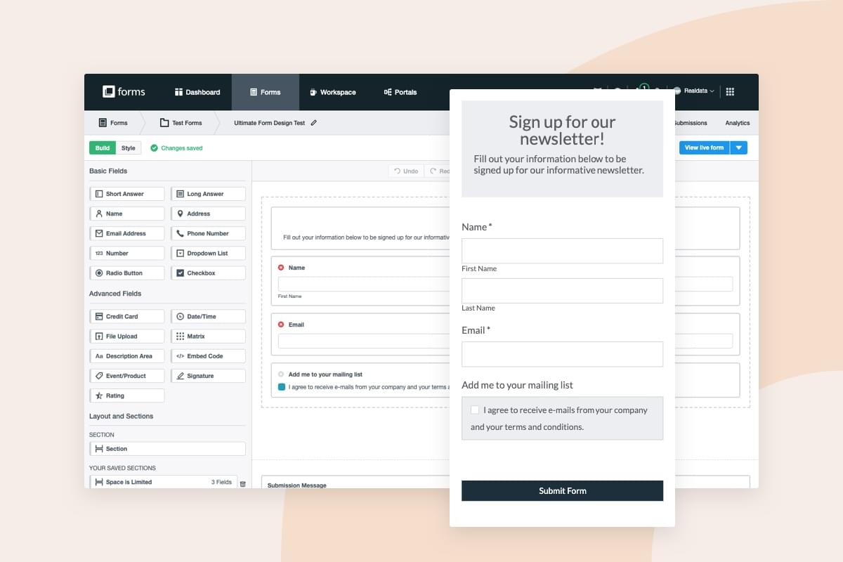
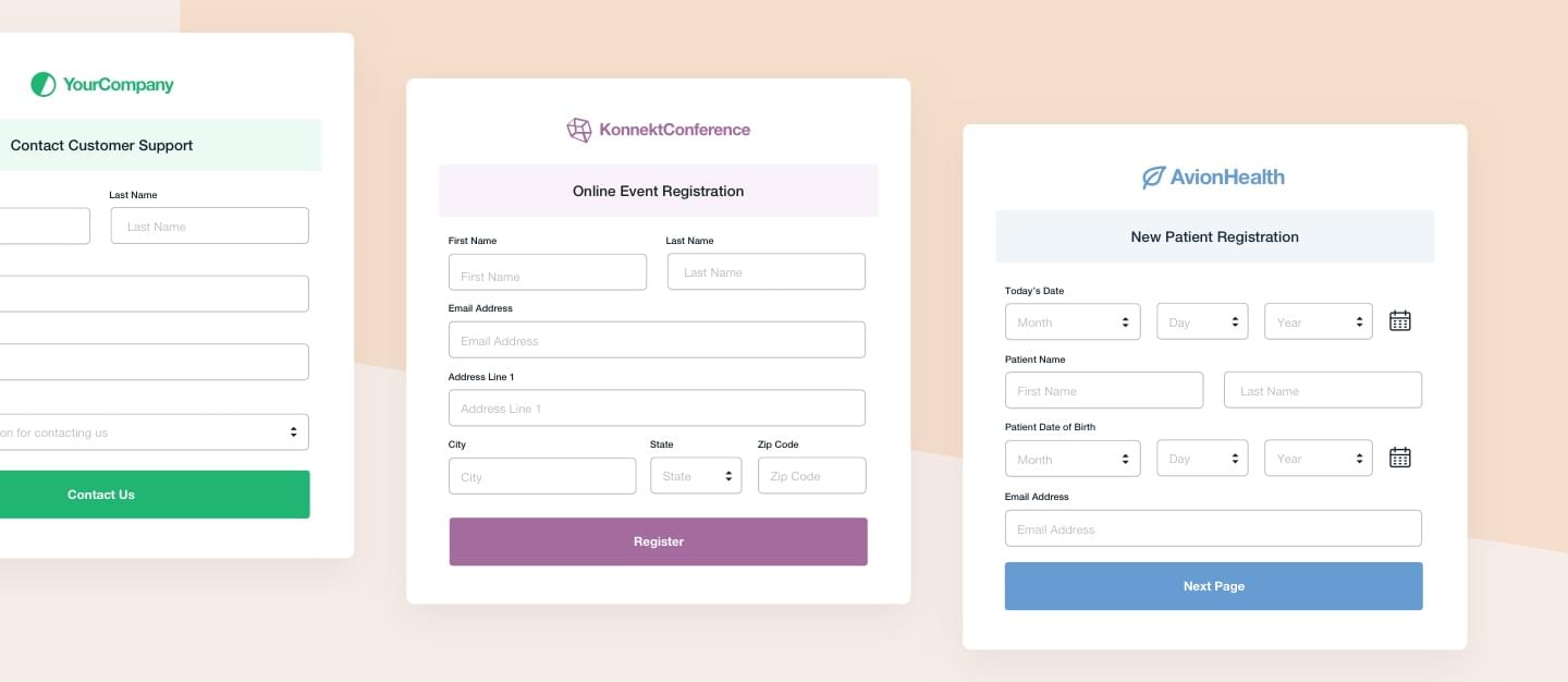
Field Types: Optimizing Your Questions in 5 Steps
Questions lie at the heart of your form and should be clear, concise, and easy to understand. Follow these quick steps to make sure you’re providing people with a simple and inviting form experience.
Step 1
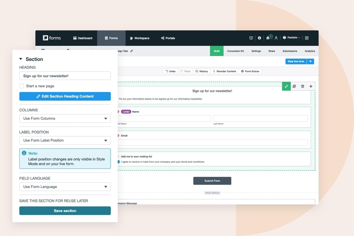
Group related questions into sections if your form has more than six fields. This will guide users through the form and improve the overall flow.
Step 2
Don’t ask unnecessary questions. People don’t like giving out private information, so be certain you’re only asking for the information you truly need.

Did you know? It took $12 million in lost profit for Expedia to discover the cost of a confusing field. Asking consumers to provide a "company name" when buying a travel package is a perfect example of how jarring an irrelevant question can be.
Step 3
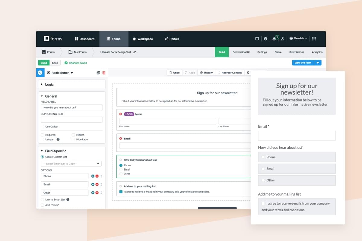
Know when it's appropriate to use radio buttons, checkboxes, and dropdown fields:
- Use radio buttons when only one answer can be chosen.
- Use checkboxes when multiple options can be chosen.
- Use a dropdown if there are 5 or more options and only one can be chosen.
Step 4
Vertically stack radio buttons and checkboxes. Single column forms are easier to visually process, and they are less challenging to fill out on mobile.
Step 5
Use copy to guide your users and show them how to fill out a field correctly. Field labels help explain why you need certain types of information or how it needs to be formatted.

Have you considered this?
Selectable images have become a popular question format because they tend to have high engagement. If it serves your form’s purpose well, try adding a selectable image question and see how it affects your response rates. Images can also work well for ratings.
Form Branding: A Quick Checklist
The way your form looks has a huge impact on user perception. Don’t turn people away with ugly design. Here’s a simple checklist you can follow to create forms that look branded and professional:
- Avoid fonts that are difficult to read. Opt for legible fonts like Verdana and Georgia.
- Use images and gifs. Highly visual content consistently performs better than simple text.
- Use color to incite action. It's been proven that colors affect people’s decisions in many ways.
- Use quick form CSS hacks to enhance your design and nail your company branding.
Submit Buttons: The Gateway to Conversions
After you’ve tweaked your form’s length, questions, and overall look, it’s time to finish strong with an awesome submit button. Since this is your call to action, it’s one of the most pivotal elements on your form. How you design and position your submit button can mean the difference between getting a ton of submissions or getting only a handful.
Your submit button can do two things for you:
• Encourage people to take some kind of action
• Show people where they can take that action
If your submit button doesn’t pop out to people right away, chances are they will click away from your form before converting. Here are some design tips to follow to ensure your submit button stands out:
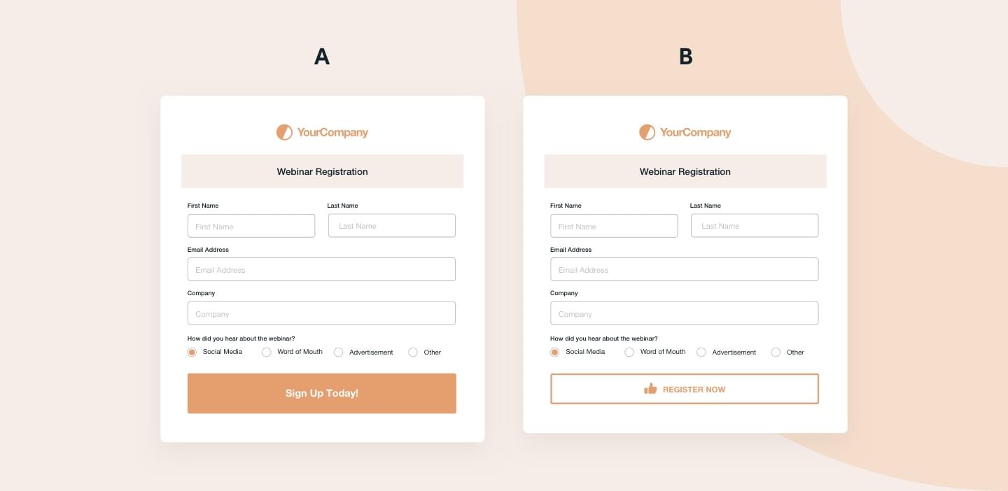
Make It Colorful
Any color that contrasts well with other colors on your form can entice clicks. Use a bright, bold color to pull attention to your submit button.
Test Options
Just like other elements on your landing page, it’s important to test your submit button. Try out different button colors, sizes, and text to see what improves conversions the most.
Be on Brand
Your submit button should be treated like any other piece of marketing. Keep the color and copy on brand to stay consistent.
Change Up The Wording
Just because it’s a submit button doesn’t mean it always has to say submit! Try out different call-to-action phrases to see which catches the eye of your audience the most.
Get Additional Form Design Tips
Want more online form tips and tricks? Sign up for our newsletter to receive workflow hacks, optimization recommendations, and more!